Responsive web design for stable display

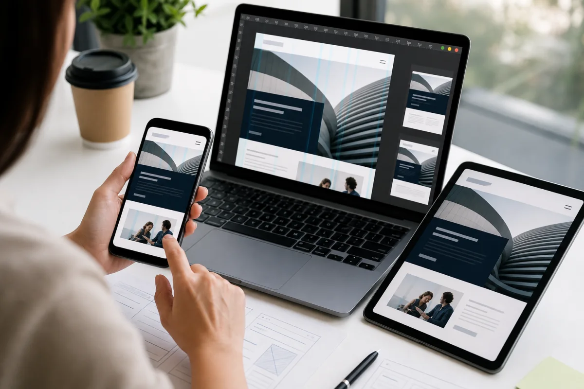
Reiz Consulting builds websites so that content remains clearly readable and usable on desktops, tablets and smartphones.

Approach responsive web design in a structured manner.

Reiz Consulting builds websites so that content remains clearly readable and usable on desktops, tablets and smartphones. What is crucial is a clear structure so that content, technology and implementation fit together.

DesktopTabletSmartphoneUsability

Responsive web design at a glance

Responsive web design requires reliable layouts, readable content and easy-to-use navigation on smartphones, tablets and desktops.

Desktop

Large views need clear hierarchy, clean text widths and quiet areas for concentrated reading.

Tablet

Tablet layouts must display navigation, maps, forms and contact areas without overlays.

Smartphone

Mobile views prioritize H1, utility, CTA, contact, and readable content without horizontal scrolling.

Usability

Buttons, menus, forms and cookie settings are checked for touch targets and keyboard operation.

Why responsive web design is more than scaling

Responsive web design becomes reliable when content, navigation and interaction are planned for real screen sizes. Reiz Consulting therefore checks layout, text lengths, buttons and contact channels together.

This results in clear next steps instead of isolated measures.

Typical tasks

Typical tasks include analysis, structuring, coordination, implementation, documentation and testing. The scope is tailored to the actual requirements.

Related topics are included where relevant to maintain continuity from planning through implementation and operations.

Which type of support fits?

The right support depends on the current situation, the objective and the decision that needs to be prepared.

When mobile or tablet views cause problems

Initial assessment

Suitable for an initial operational and technical assessment.

When interfaces arise

Coordination

Suitable for coordinating stakeholders, content and technology.

When implementation is being prepared

Structure

Suitable for priorities, responsibilities and next steps.

If results are to remain sustainable

Review

Suitable for quality assurance, documentation and continuous improvement.

Support for each project phase

Clear phases keep analysis, structure, implementation and continuous development distinct.

Analysis

Understand the current situation

Objectives, the current setup, risks and stakeholders are documented clearly.

Concept

Plan a robust structure

Content, interfaces and implementation steps are structured.

Implementation

Deliver in practical stages

Measures are implemented and reviewed in a traceable way.

Operation

Sustain the results

Documentation, maintenance and continuous development are planned from the outset.

How good support can be recognized

Clear responsibilities, traceable results and practical implementation are what matter.

01

Clarity

Goals, boundaries and responsibilities are understandable.

02

Traceability

Decisions and results remain documented.

03

Interface awareness

Adjacent areas are included early on.

04

Robustness

The solution remains usable and expandable.

Responsive web design in a project context

Reiz Consulting supports projects where responsive web design must be coordinated with related topics, teams and decisions.

  • Desktop
  • Tablet
  • Smartphone
  • Usability

Our approach

Pragmatic enough for quick orientation, structured enough for reliable results.

  1. 01

    Understand

    Clarify the starting point and goal.

  2. 02

    Structure

    Structure topics and interfaces.

  3. 03

    Implement

    Implement measures in appropriate stages.

  4. 04

    Check

    Evaluate and further develop results.

Brief project assessment

A few details are enough for an initial assessment and usually make the appropriate next step clear.

  1. 01Current situation

    What exactly should be improved in the mobile or responsive display?

  2. 02Environment

    Which pages, systems, teams or project areas are affected?

  3. 03Next step

    What decision or implementation is needed now?

Get in touch

Think carefully about mobile and tablet?

We check how navigation, maps, texts, buttons, contact areas and footers work stably on desktop, tablet and smartphone.

  • Identify problematic views or devices
  • Prioritize content and contact channels
  • Plan responsive implementation or correction

Frequently asked questions

Answers to typical questions about responsive web design and initial assessment.

What does responsive web design mean?

Responsive web design ensures that navigation, content, maps, buttons and contact areas function stably on desktop, tablet and smartphone.

Which screen sizes are checked?

Typical mobile, tablet and desktop viewports are tested so that texts, buttons, menus and maps do not overflow or become inoperable.

Why is mobile friendliness important?

Many users and search engines first evaluate websites from a mobile perspective. A mobile site must make the same important content clearly accessible.

Are texts and buttons checked?

Yes. Texts, call-to-actions, forms, FAQ elements and footers are checked so that they remain readable and operable on small screens.